Trajan Capitals Astonishing Secret
For almost two thousand years a large, rectangular slab of marble in the middle of Ancient Rome, containing a surprisingly humdrum text, has been causing awe and wonder in the world of lettering and calligraphy.

We all know the letterform: regal, upright majestic Roman capitals; six alphabetic lines which, we’re told again and again by all the books, show us exactly how a capital letter should look. Elegant, strong, spacious, a judicious use of thick and thin strokes; the Trajan letters are just so damned beautiful.
But for 1,849 of those years everyone who ever asked the question: ‘Why are these letters so good looking and how were they made?’ got it completely wrong.
Every expert who tried to come up with an answer resorted, rather tragically, to the same reasoning:
1. These Trajan Capitals letters are brilliant.
2. I also make brilliant letters.
3. Therefore these Trajan Capitals letters were made in the same way I make letters.
This led to all kinds of widely held (and wrong) theories. Perhaps the Trajan letters were made by drawing around templates; perhaps they were drawn in outline and then carved out; perhaps they were made geometrically with a compass and ruler; perhaps the basic forms were made with an edged tool such as a reed and then all the fiddly bits carved by the stone carver. And on and on.
In 1962 Edward Catich published his book, The Origin of the Serif, in which he followed, yet again, the same reasoning as everyone else. The only difference was that the way he made his brilliant letters was indeed very similar to the way the Trajan letters were made. It turns out he didn’t go far enough, however, as we’ll see later… Catich finally uncovered Trajan’s astonishing secret but before I can reveal what that is (it’s not that they were made with a brush!) we have to delve into more details about what we mean by ‘lettering’.
There are lots of ways to make a letter A. Here’s are four

Catich thought there was something special about the first and second of these examples. He called these ‘writing’ and he called the other two examples ‘lettering’. To discover which is which, he said, ask yourself how many parts your letter has and then count up how many strokes you need to create the letter. If you need more strokes to make the letter than it has parts then it’s lettered; otherwise, it’s written.
How many parts does a traditional capital A have? To keep things simple, let’s say it’s five: two stems, a crossbar, and two-foot serifs.

So, our first example is written: it took just one stroke to make the five parts of the letter A. The second is also written: it took exactly five strokes to make all five parts. The third one took me eight strokes, which is more than five so it was lettered. The last one is interesting: it’s obviously from Carol Twombly’s famous Trajan font. You might say it took me just a press on a keyboard to make this letter. But think about the many hours Twombly took drafting and redrafting this shape. She might have made thousands of mouse strokes to get it right. That’s definitely a lettered shape.
Why was Catich so insistent on this distinction? He was frankly a bit annoyed by all the other so-called experts who had examined the Trajan inscription. He noted that every single one of the techniques they proposed was a form of lettering. They all involve a huge amount of hard, careful work, which would take ages to get this inscription on its marble slab. No sane signwriter could afford to spend that much time on a job if they wanted to make a living. So there had to be another technique involved.
The clues he presents to us are really, really obvious and it’s shocking that generations of lettering professionals failed to spot them. It’s a classic case of ‘confirmation bias’: all these pros wanted to prove that they understood the secret, and they positively ignored any evidence which would immediately prove them wrong. By being a bit more scientific, Catichwas able to put them all in their place.
Firstly, he tried something very simple but devastating to all the theories based on templates or geometric construction. He traced round two identical letters on the same line, like the two Ss on the third line. Then he put one on top of the other.
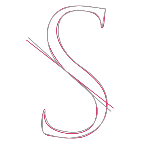
They were different! Why would anyone go to the bother of carefully constructing two different Ss? It’s a sophisticated enough shape to design once, never mind doing it twice.
He tried this with many different such pairs and found the same subtle differences each time. It’s not that one of the letters is bad and the other one better: they’re both really well made in their own way.
Another thing Catich noted is more subtle but really clever. Let’s look at the third line of the inscription

Look how generously spaced the first few letters are in TRAIANO. But around the middle of the line there are lots of large, round letters coming up and everything’s getting bunched closer and closer together. Indeed, the final letter F just about squeezes into the end of the line before it runs out of marble. Consistent letter spacing has been sacrificed for consistent letterforms.
Now look at the first five lines: they all start out with this generous letter spacing which gradually reduces throughout the line. At the start of each new line our maker would beginwith these generous intentions but then realise that space was running out and he’d better start getting the letters closer or he’d run out of space. Now, on the sixth line it looks like he’s learned his lesson. The letters are all squeezed together at the beginning and then.. oh no.. not enough letters left so he has to start spreading them out again!

Assuming you learned to write an alphabetic script as a child, do you remember at school when you were maybe seven years old and you were writing a story. You’d get towards the end of a line with a long word to write. You had two choices: squeeze the word into the remaining space or start a new line. What did you do? No child ever starts a new line in this case, and neither would our Roman maker. Both the child and our maker are deciding where to put each letter, as it is being made.
Thirdly and most obviously, Catich noticed shapes in the letters which appear consistently again and again and which he was very familiar with, as a Chicago signwriter. He was used to making shop signs really quickly with an edged brush. He understood very well why the curve of the C, for example, had that particular shape if it was made in a single stroke with one of his brushes, or how the serif on the middle arm of the E would naturally result from a quick twist of the edged brush.
We all know that Catich discovered that the letters were made with such a brush but the secret he revealed was something far more important.
At the end of his famous book, he shows the brushstrokes he thought were needed to make the Trajan letters. It’s a very impressive discovery of a hugely efficient technique which allows someone to make all the letters of the inscription in a few hours, rather than a few days. In every case he proves that the letters were all written, not lettered. Each letter needs only as many strokes as it has parts, often many fewer. The E, for example, has nine parts and is executed in only five strokes. Every other technique I’ve come across to make a perfect Trajan E is much, much slower.
So, what’s this secret I’ve been alluding to all along? It’s that we now know the Trajan inscription is not a piece of typography, or a laborious work of platonic lettering; it’s a piece of calligraphy. It really is. It’s full of idiosyncrasies, of mistakes, of the movements and breath recorded intimately in each different stroke. It answers the question of why we think it’s so beautiful: it’s bursting with life. It has absolutely nothing to do with the much later experiments in typefaces and industrial repetition (although the Romans were big into that) and the soullessness of things made by machine. It’s calligraphic in the biggest, best sense of a skill which, executed expertly, is capable of recording the very being of a human.
And that brings us to what we should be doing with it. If you’re a calligrapher then the Trajan inscription is yours. Just as much as Harley 2904 or Wang Xizhi’s Ritual to Pray for a Good Harvest. We learn our craft from history, from copying historical manuscripts (Latin for ‘written by hand’). It’s how we get to grips with our writing tools. Usually, we have lots of exemplars to choose from. There are endless good examples of uncial scripts from the past, for example. But there is only one Trajan. And we can now safely call it a script. What can we learn from this script? Well, take my case.
I came across the edged brush when I was about sixteen and had no idea how to wield it. Something about the huge, glossy, black geometric shapes which emerged from its tip were intoxicating to me. I was told to go and study the single copy of Catich’s book in St Bride’s printing library in London (many years before the second edition was published). It took me seven years to learn his script but during that time I found Catich had missed many details. I was young enough and big-headed enough to believe I could improve on his seminal work. This led to a book published in 1999 called Formal Brush Writing which showed that you didn’t have to approximate the letters as Catich had done, but, while still writing and not lettering, you could get all the exact details of the original letters with just a bit more work with the brush. The book sold out and unfortunately I lost the computer files in one house move or another, so haven’t made a new edition since.
Doing this work I realised that we, the calligraphic community, have absolutely no idea how powerful the edged brush is as a calligraphic tool. It’s capable of a huge array of shapes which the edged pen knows nothing about. Treating the brush as a large pen is a tragic waste of a very subtle and potent tool. If Catich is historically accurate then it turns out there is a rich, albeit underdeveloped, tradition of brush writing in the West. And calligraphers have the responsibility, dare I say ‘duty’, to investigate it thoroughly.
I’m an artist, not a historian so, truth be told, I don’t care how the original Trajan inscription was made. Whether Catich made a discovery or an invention isn’t important to me. What is important is that he showed us the way of the edged brush. By following his example, and our single historical exemplar, and our own imagination, we can expand our understanding and practice of calligraphy to the point where, as in my own work, we are no longer bound by what we narrowly think of as ‘calligraphy’. I stopped writing words years ago but continue to write, in a much more general sense, with my edged brushes. Every single brushstroke I make to this day is just a small variation on the cross-bar of an A or the bottom stroke of an S or the wildly improbable but genius bottom arm of the letter E, all from perhaps the least understood and most important calligraphic script of all, Trajan.
Article by Tom Kemp
Recent Podcast with the author: